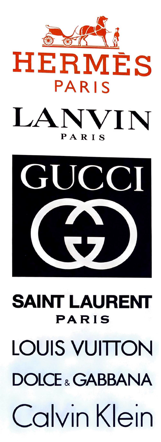
This range of logos and wordmarks represents a who's who of high-fashion labels. The horse-drawn carriage of the Hermes logo nods to the brand's roots as a harness workshop, while its slab serif letterforms recall the Memphis typeface, designed by Dr. Rudolf Wolf in 1929. Below is Lanvin's wordmark, which uses a Transitional typeface that's neither Old Style nor Modern, and Gucci's signature double-Gs, designed by founder Guccio Gucci's son Aldo Gucci. Saint Lurent's logo follows. Although then-creative director Hedi Slimane scandahzed the_ fashion world in 2012 when he rebranded Yves Saint Laurent's ready-to-wear hne as saint Laurent, using Helvetica for the logo, the refresh was actually a revival of the word mark and name of the ready-to-wear boutique that Laurent originally debuted in 1966, called Saint Laurent Rive Gauche. At th_e botom of the page are wordmarks for Louis Vuitton, Dolce & Gabbana and Calvin Klei, whose geometric sans serif letterforms evoke Futura, designed by Paul Renner in 1924. Raf Simons, chief creative officer of Calvin Klein, debuted a new, all-uppercase wordmark for the brand in February 2017.


