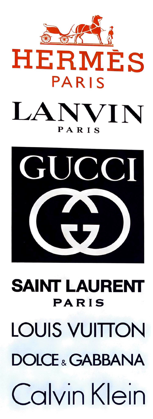
Even Luxury Brand Need To Stay Current...
This range of logos and wordmarks represents a who's who of high-fashion labels. The horse-drawn carriage of the Hermes logo nods to the brand's roots as a harness workshop, while its slab serif letterforms recall the Memphis typeface, designed by Dr. Rudolf Wolf in 1929. Below is Lanvin's wordmark, which uses a Transitional typeface that's neither Old Style nor Modern, and Gucci's signature double-Gs, designed by founder Guccio Gucci's son Aldo Gucci. Saint Lurent's logo follows. Although then-creative director Hedi Slimane scandahzed the_ fashion world in 2012 when he rebranded Yves Saint Laurent's ready-to-wear hne as saint Laurent, using Helvetica for the logo, the refresh was actually a revival of the word mark and name of the ready-to-wear boutique that Laurent originally debuted in 1966, called Saint Laurent Rive Gauche. At th_e botom of the page are wordmarks for Louis Vuitton, Dolce & Gabbana and Calvin Klei, whose geometric sans serif letterforms evoke Futura, designed by Paul Renner in 1924. Raf Simons, chief creative officer of Calvin Klein, debuted a new, all-uppercase wordmark for the brand in February 2017.
Homage to Swiss Graphics...
B R A N D I D E N T I T Y
Creating or refreshing a brand identity for a client is a dream job. When designing sometimes you are influenced by design styles that are timeless. Swiss graphics are one of those styles.
Title: Actionable Brand Identity
Design Firm Underline Studios, Toronto
Creative Team: Claire Dawson, Fidel Pena, Hannah Lee and Tony Leighton
Client: Actionable
Appeared in HOW Magazine Design Annual - Spring 2018
Hashimoto Machiko - Ceramicist
Today’s design inspiration…
Typography Typography Typography!
D E S I G N I N S P I R A T I O N
The haphazard design and free flowing typography gives this brochure the freedom and energy needed to convey the mission of the client.
The design is for Playwrights Horizons, a writer’s theater in NYC dedicated to the support and development of contemporary American playwrights, composers and lyricists and to the the production of their new work. The was designed by Jeff Rogers (Brooklyn, NY), Bradford Louryk - Design Director, Zack DeZon, Photographer and Playwrights Horizons, client.
Appeared in Communication Arts Magazine’s Typography Annual, 2016


